A New Logo

After many intra-office discussions, we decided to codify our thoughts, aspirations, + interests before embarking on a logo redesign.  Armed with Brand Deck, we devoted a working session to what we are, what we are not, + what we want to become.

To understand the history of our logo is to know our history.  From humble beginnings to …

1993-1996: PJA Architecture began in 1993 when our founding principal established Phillip Jordan Architects in the attic of his house.  From the outset, Phil recognized that the technological advances of the early 90’s would provide his one-man studio with the ability to offer quality architectural services to clients of all sizes.  To demonstrate the easily repeatable precision the computer allowed in drafting, Phil developed a logo that mixed geometry and line types/weights with ordering principals that the computer and pen-plotters could effortlessly reproduce.

PJA 1993-2002 Composite.jpg

1997-2002: Having laid a solid foundation for Phillip Jordan Architects, Phil knew that the company was now a recognizable brand within the sphere of his current clients and increasing staff.  The practice had grown during the initial years and it was time to revise the logo.  Phil wanted one that was bold, easily identifiable and continued to demonstrate the influence of the digital techniques, available at the time, in PJA’s workflow and design thinking.  An expressive font was chosen for the acronym of the company, a drop shadow added to the letters and five squares [in reference to the geometry of the initial logo] where rhythmically placed below the letters.  

2003-2004: By the early 2000’s, 3d renderings were becoming commonplace in the architectural process.  In keeping with the founding principles of the firm, Phil cultivated a culture of experimentation with the digital methods of the time.  The revised logo envisioned the PJA as solid red letters whose shadow was created by a light source that could be placed within the 3d space of a digital model.  The initial rendering was advanced by the standards at the time, but PJA was about to refine and master cutting edge rendering techniques.

2004-2012: Refining the previous logo was a priority given the increased capabilities of rendering software and hardware that PJA was beginning to acquire.  The background for the logo was imagined as a sphere that existed behind the letters and squares.  This gave PJA the opportunity to showcase the ray-tracing and complex illumination strategies of the rendering software.  The color of the letters was made bolder and the spot lights positioned to exaggerate the shadows and depth of the letters.

PJA 2002-2015 Composite.jpg

2012-2015: Having steered PJA through the difficult recession, Phillip Jordan Architects became PJA Architecture as Christian joined Phil as a principal of the firm.  In the process of weathering the tumultuous times, PJA became more lean and agile, and as a result the logo underwent minor revisions.  The red of the letters was made more uniform and the shadows given a stronger logic.  The paring down of the logo set the stage for what was to follow.

2015 – : With PJA becoming a recognizable part of the community and continuing to expand its client base, we sat down and discussed the state of the firm in terms of: what we are, what we are not, + what we want to be.  What followed were several months of deep, revealing discussions about the studio and our culture.  Countless iterations were studied, the last of which were refined with the input of a local graphic designer.  What we concluded was we wanted a logo that was bold, clean + ordered.  As Bruce Mao posited in his Incomplete Manifesto for Growth:

29.  Think with your mind. Forget technology. Creativity is not device-dependent.

We wanted a logo that was not driven by the technology or the software at the time, but rather the ethos of the firm.  The A of PJA retained the red as an homage to the founding company name and that it all began with Phil.  ARCHITECTURE took the place of the squares below the PJA and maintains the drop shadow that has been an important part of the logo for so many years.  The A of ARCHITECTURE is given color as well so that it appears to rise above the rest of the letters as an indication of where we believe we are heading.  After 22 years, we are looking forward to the future while remembering our history.

An Open Letter to NCARB

Dear NCARB,

First of all, thank you.  Thank you for looking out for me, an emerging professional, as I make my way through my architectural education and the path to licensure.  Thank you for making sure I don't end up as the stereotypical intern who fetches coffee for the boss and hides in the corner drawing bathroom details. 

Read More

NCARB Fire Sale

Can we have an open, honest discussion about the fire sale going on with architectural licensure being promulgated by NCARB? This was the subject of the email I received on July 1st, directly from NCARB: “IDP Required Hours Reduced by a Third.” 

Read More

NCARB, Interns + the AREs

Ask a licensed architect about the examination process and he or she is likely to tell you tales of insurmountable odds, sleepless nights and how nothing could have prepared him or her for the challenge of the AREs.  Now ask a registered architect from the preceding generation about the junior architect's experience and you are likely to hear how much easier the registration process has become for the younger generation.  It seems as though every so often, NCARB challenges itself to figure out a way to alienate each subsequent crop of registered architects from those that came before.

Read More

Lessons From the Classroom

Within the office, we are proud of our combined 10+ years of teaching on a college campus.  We believed, early on, that having a presence in the class room would allow us to remain current as technology and teaching methods evolved.  What follows are a few of our observations from along the way.

Read More

Look: It's What Architects Do

Look: It's What Architects Do

We have been taught from an early age that the sky is the limit + we often turn our heads upward to imagine what could be. Many good ideas start with a dream, that head-in-the clouds vision. Bringing the dream to reality, however, requires feet firmly planted. Being an architect means looking up, but looking up is not just about lifting your gaze skyward; that is only the beginning.

Read More

Architects as Experts?

In the Young Architects Forum this past December Mike Mense, FAIA posted a piece on experts + implored architectural colleagues to defend the title of expert when it came to their services. Mentioned in the brief write-up was the apparent lack of opposition voiced by the public when seeking advice + service from experts like doctors, lawyers, engineers, + accountants. If the general public holds these positions + their opinions in high regard, why can an architect not also claim expertise?

Read More

An Open Letter RE: Undermining Architectural Value

Dear Practices [you know who you are]:

We really enjoy the work that you do.  We marvel at the design skills you display, appreciate the value your work brings to communities and end users.  We constantly remind ourselves that this is a difficult profession: one that requires passion, talent and perseverance [not only from oneself, but one’s colleagues as well].  Our practice started in the attic of our founder's house.  When we were fortunate to be busy enough to hire help - the local high school student interested in becoming an architect - we paid him.  We are proud to admit that every intern has received a fair hourly rate for their work.

Read More

PJA as Buildings

PJA as Buildings

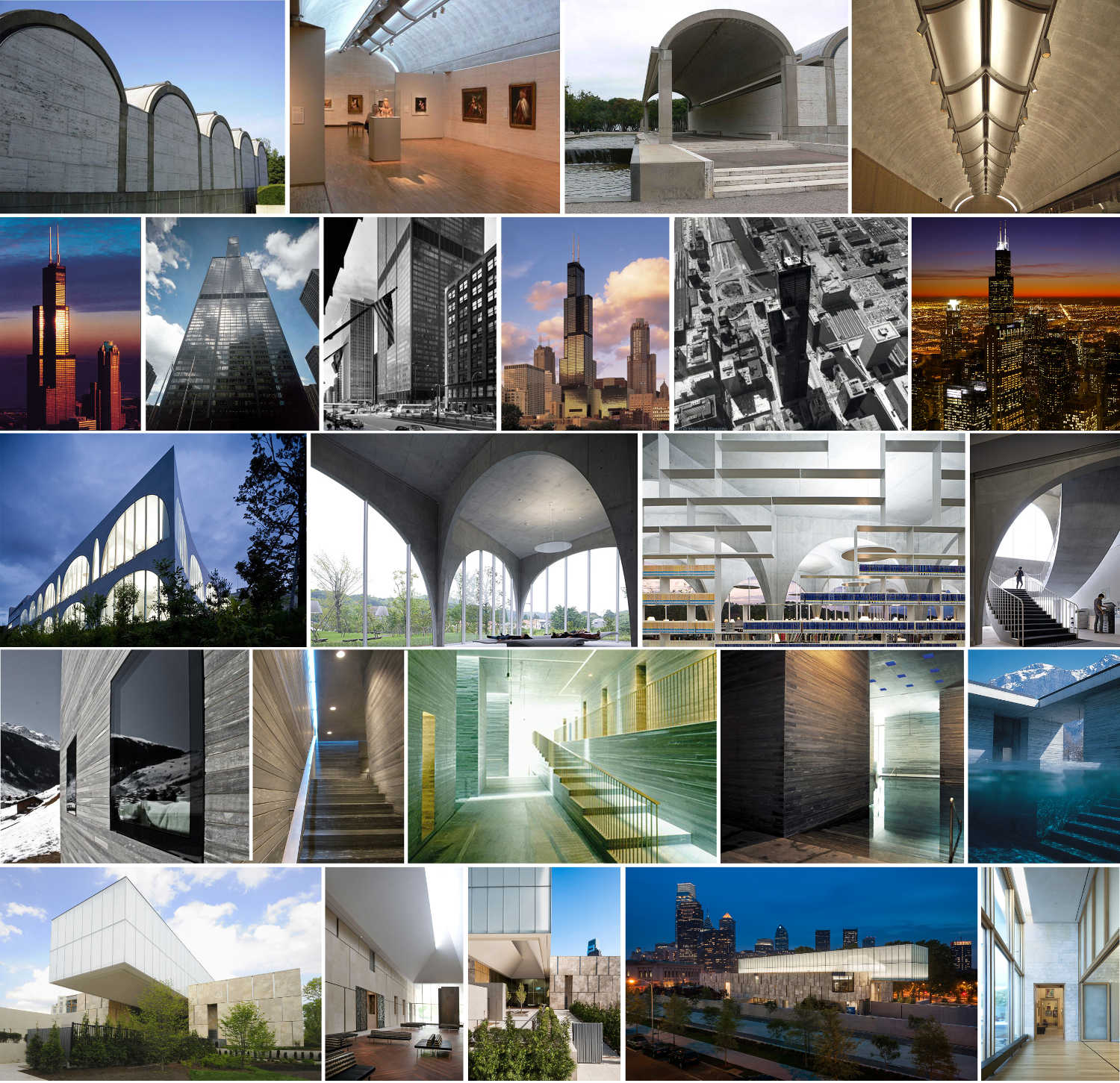
Before we get too far, we thought it would be fun to introduce the PJA staff.  As an exercise, we answered the question: "What building best represents each of your co-workers?" 

Read More

Why We Write

Our daily discussions seem to occur organically with some tangents rendering the original thought obsolete.  We recognize that design is hollow without effective communication.  Writing a blog gives us the ability to formalize + refine our thoughts - no one appreciates pointless pontification.  What follows exists as part of our narrative.

Read More